The Challenge:
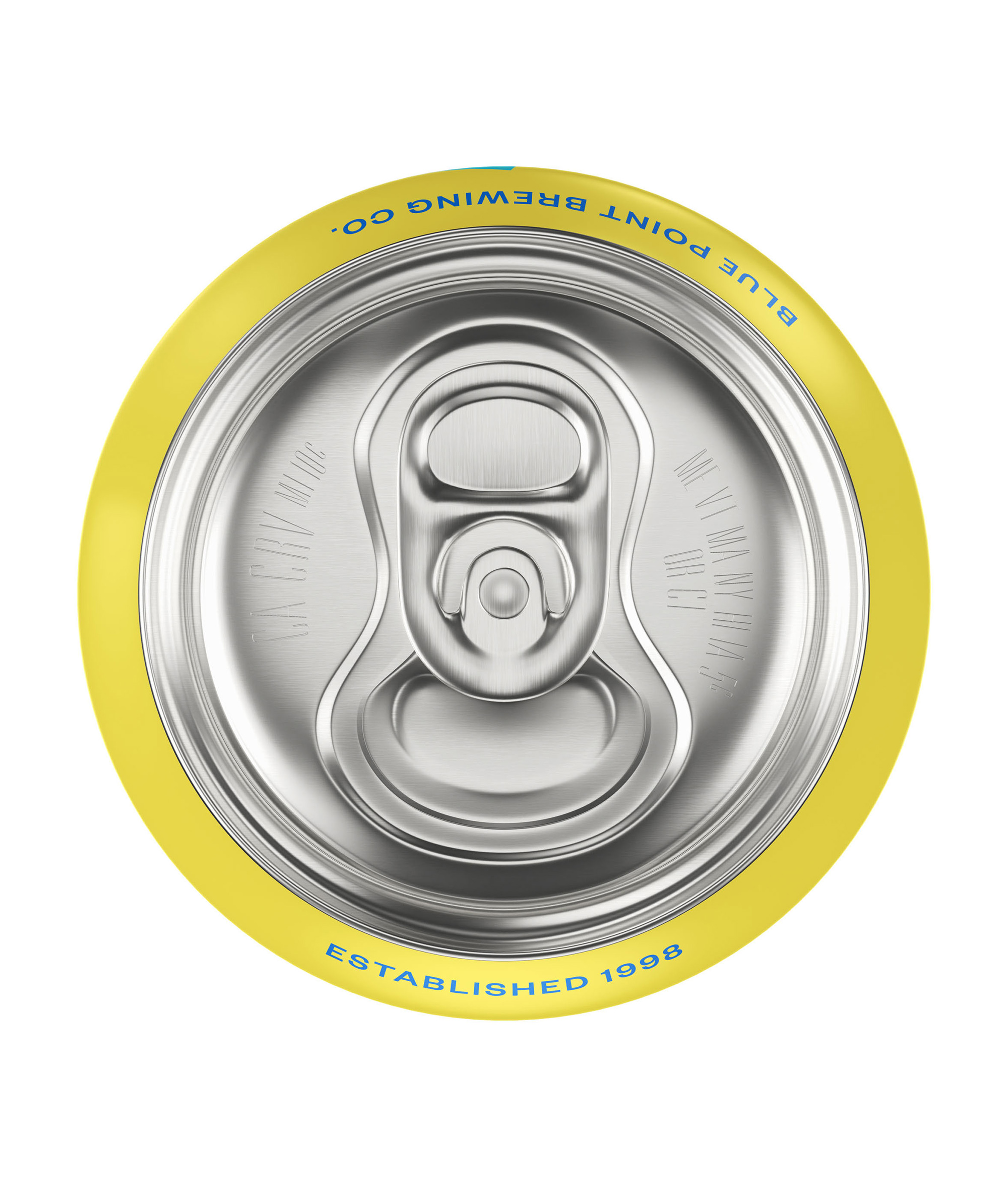
Beverage packaging may appear simple at first glance, but creating a convincing render requires careful control over proportion, surface response, printed graphics, and lighting. The challenge in this project was to make the can feel tactile and believable while preserving the clarity and impact of the branding. Metallic surfaces, subtle reflections, condensation or finish variation, and label alignment all had to work together to create an image that felt realistic without losing its commercial sharpness.
The Goal:
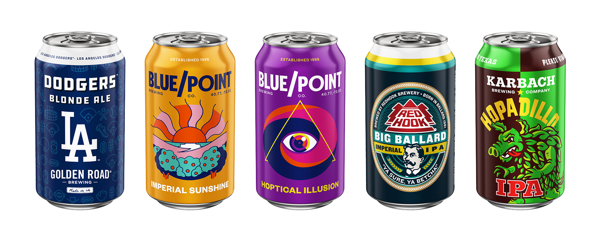
- Create a photoreal 3D rendering of Blue Point beer can packaging
- Present the product in a clean, premium, and brand-forward way
- Develop believable aluminum, printed label, and surface material response
- Use lighting and composition to support both realism and shelf appeal
- Produce final visuals suitable for portfolio presentation and commercial-style usage
The project began with building and refining the beer can asset, making sure the proportions, edges, and overall form felt accurate and production-ready. Even with a relatively minimal object, small details play a major role in realism, so attention was given to the can’s silhouette, top structure, and how the label artwork wrapped and sat on the surface. The objective was to create a foundation strong enough to support close-up rendering and polished hero compositions.
A large part of the process centered on materials and presentation. Beverage packaging depends heavily on subtle surface behavior, especially when working with aluminum finishes, printed graphics, and controlled reflections. I focused on developing materials that felt believable while still helping the product read clearly and attractively in the final frame. Lighting was then used to shape the can in a way that emphasized volume, finish, and brand visibility, balancing realism with the clean visual hierarchy expected in commercial product imagery.
The final renders were designed to feel simple, confident, and premium, allowing the packaging itself to take center stage. More than a technical exercise, this project became a focused study in how restraint, surface quality, and thoughtful lighting can elevate a straightforward object into a compelling piece of product visualization. It reflects the same principles that guide strong e-commerce and brand imagery: clarity, realism, and attention to detail.