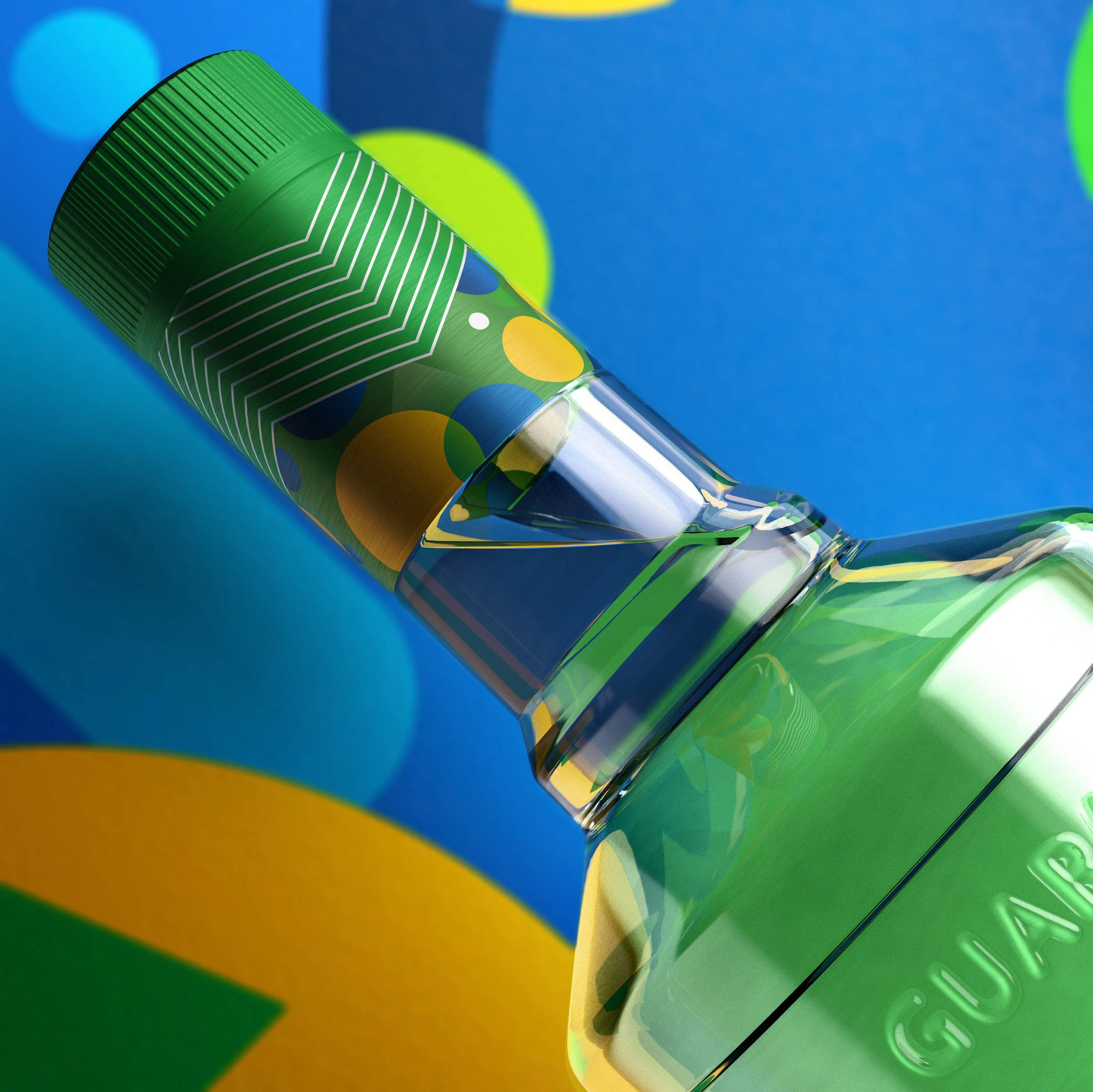
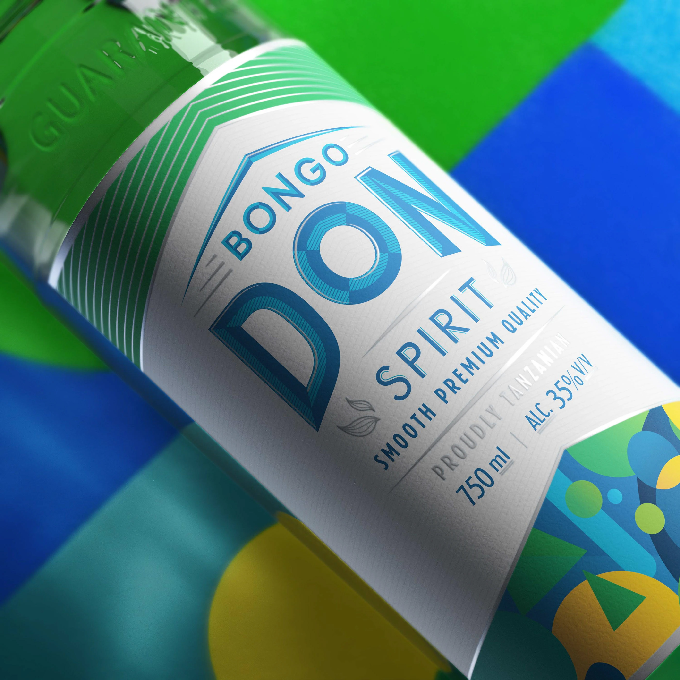
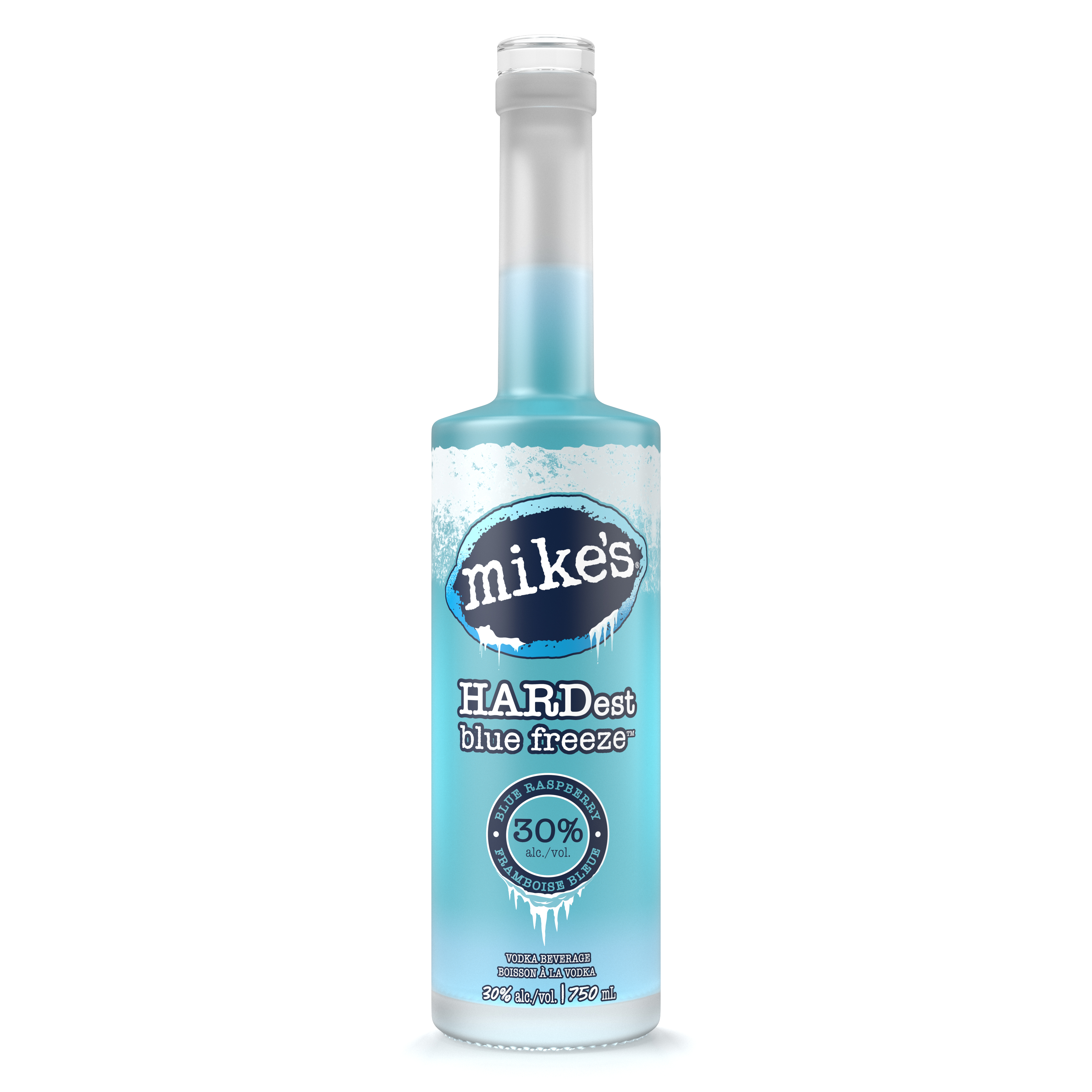
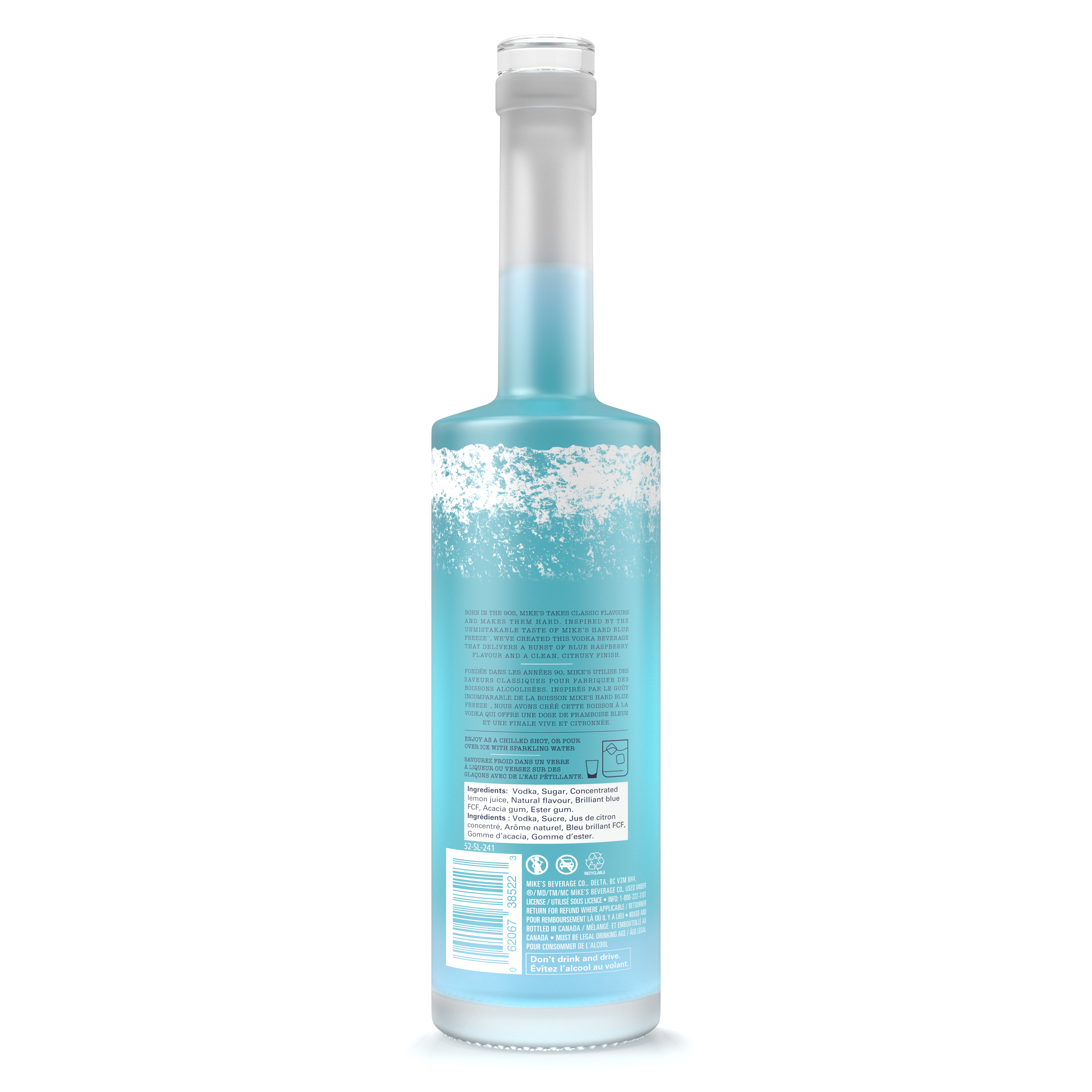
The visual approach balanced clean packaging presentation with more atmospheric, brand-driven storytelling. Each product required careful attention to proportion, label treatment, surface finish, and lighting so the renders would feel tactile, believable, and visually polished. Across the collection, the imagery needed to adapt to different brand personalities (from bold and refreshing to premium and moody) while still maintaining a consistent standard of realism and commercial quality.
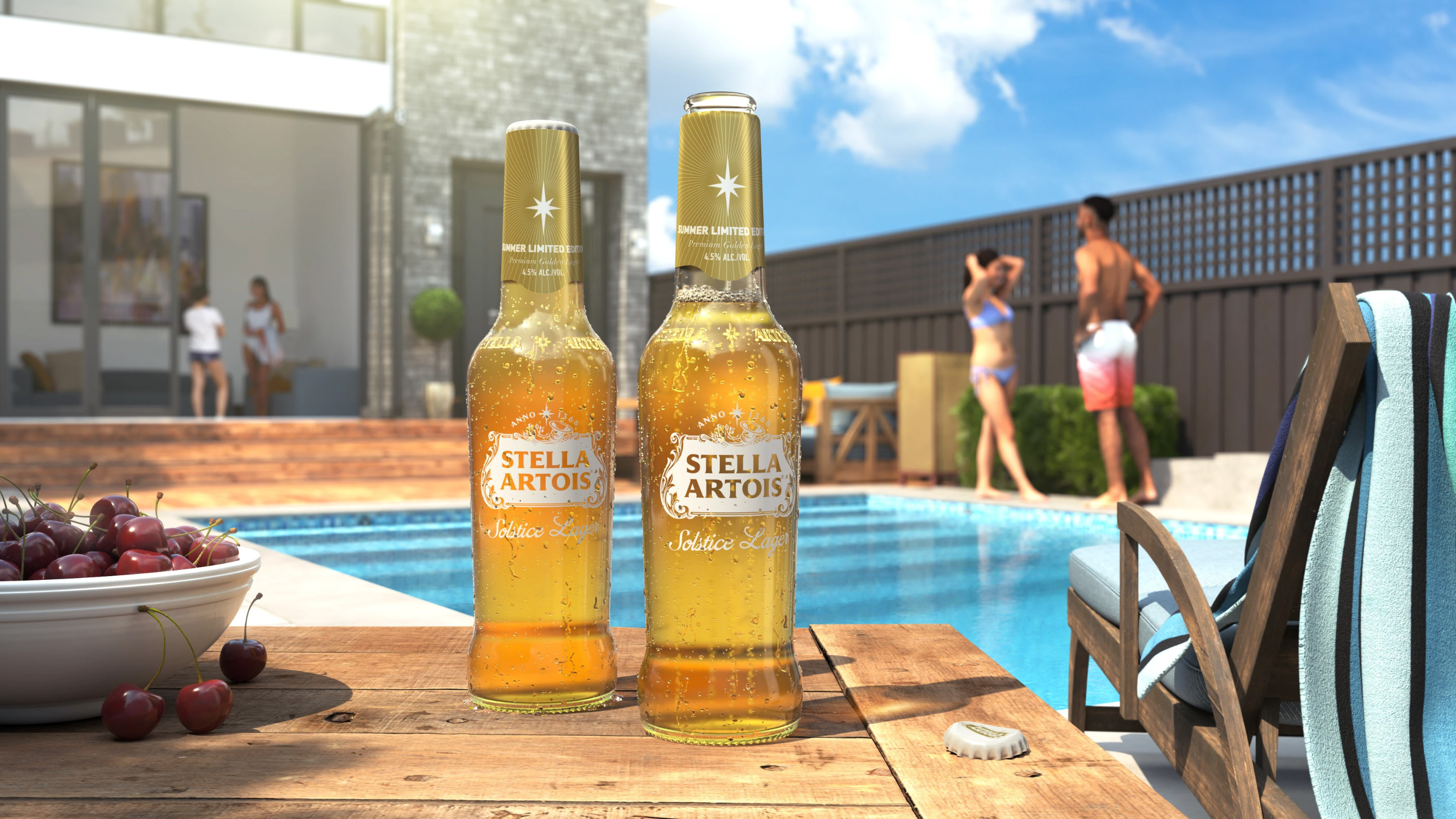
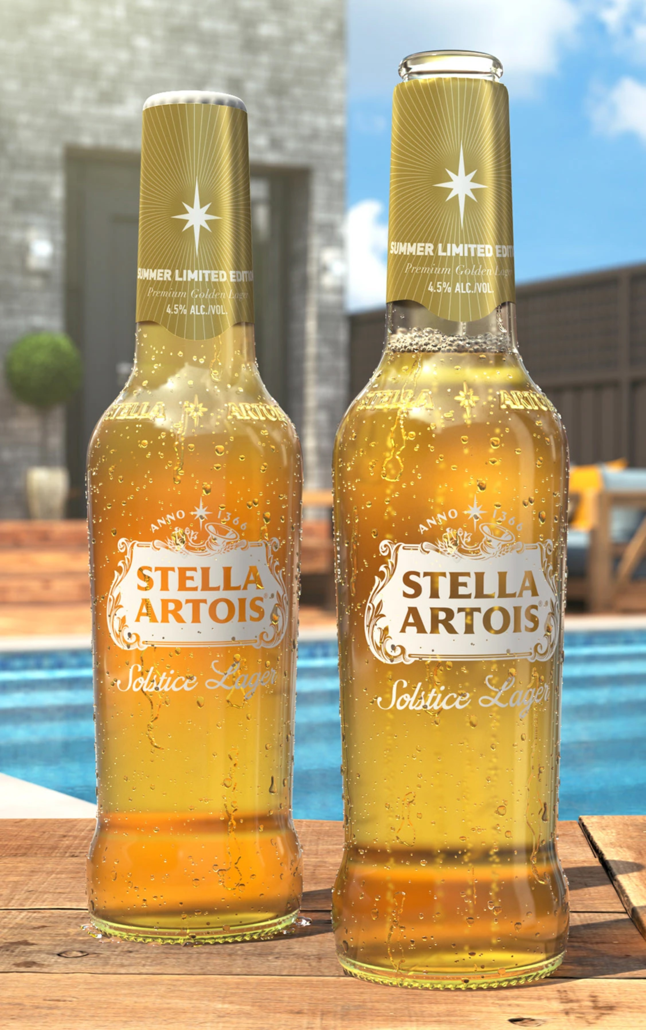
A major part of the process centered on how reflective packaging materials, printed graphics, glass, aluminum, and liquid surfaces responded under lighting. For the Stella work in particular, the fully built CGI environment helped place the product within a richer visual context, creating a more immersive image while keeping the packaging itself as the hero. The final result is a body of beverage imagery that combines strong product focus with refined art direction, resulting in visuals that feel both premium and highly marketable.